Prep Sportswear Ecommerce Redesign
Reducing customer confusion and increasing conversion rates
Overview
With roots in sports, style, history, and culture, Prep Sportswear connects people with their beloved institutions, teams, experiences, and events. Through their online marketplace, consumers can choose from high-quality merchandise such as t-shirts, sweatshirts, hoodies, and jerseys. Each product is highly-customizable, designed, and printed in the USA.
Challenge
How might we improve the site’s design and user experience to help customers easily find products relevant to their teams, ultimately boosting conversion rates?
Solution
I redesigned Prep Sportswear’s navigation and search functionality to create a more intuitive and user-friendly experience. By incorporating advanced filtering options, clear categorization, and team-specific visual cues, customers can quickly locate relevant products. This streamlined approach not only improves product discovery but also enhances engagement and drives higher conversion rates.
Uncovering opportunities through a qualitative UI/UX audit
A qualitative UI/UX audit was conducted to identify pain points and uncover opportunities to enhance the shopping experience on Prep Sportswear’s website. By analyzing user behaviors and interactions, actionable insights were developed to drive improved engagement and conversion rates.
Defining the typical Prep Sportswear customer
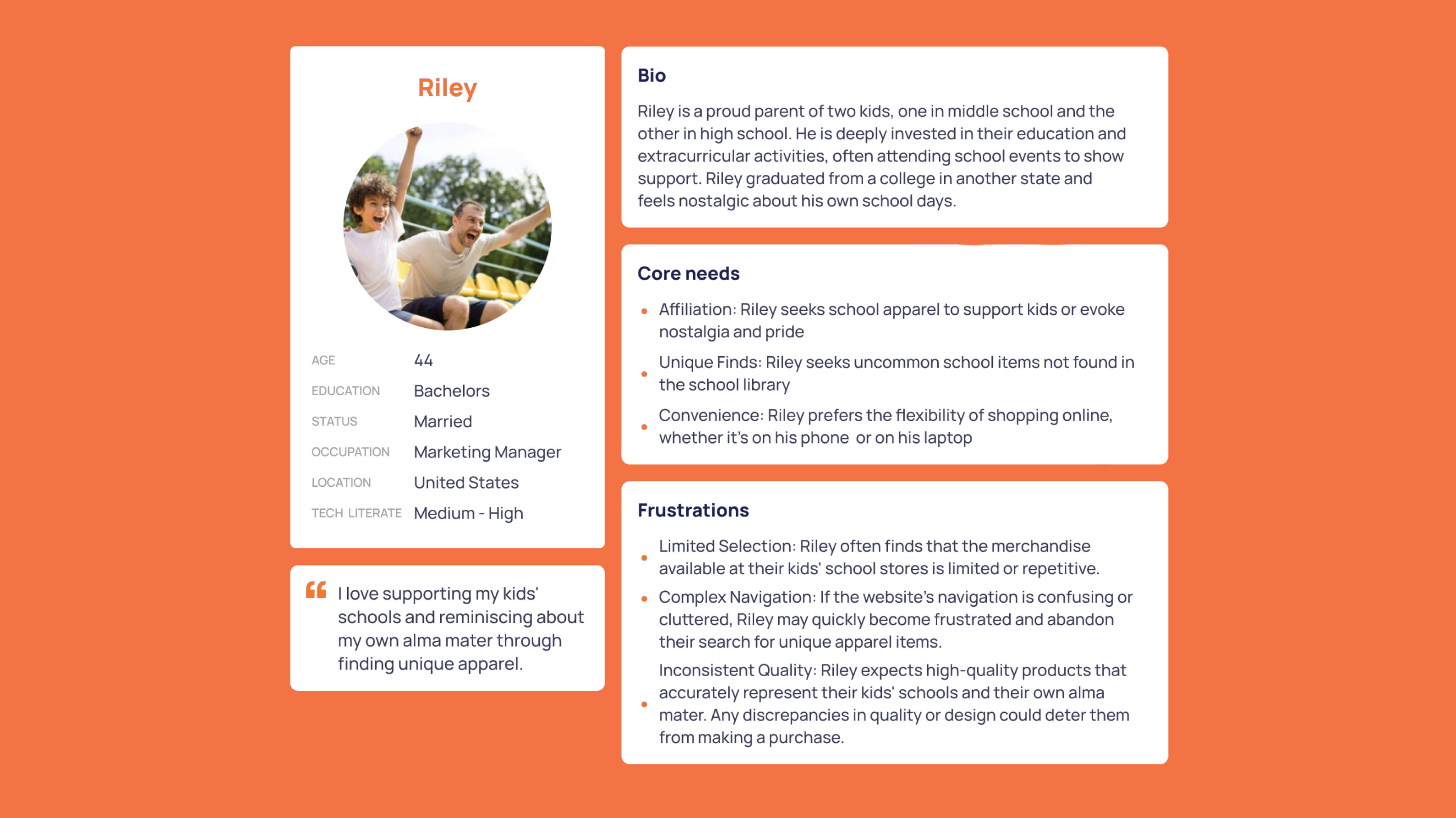
A detailed customer persona was created to represent the typical Prep Sportswear shopper, capturing their goals, preferences, and challenges. This persona serves as a foundation for designing a more user-focused and engaging shopping experience.

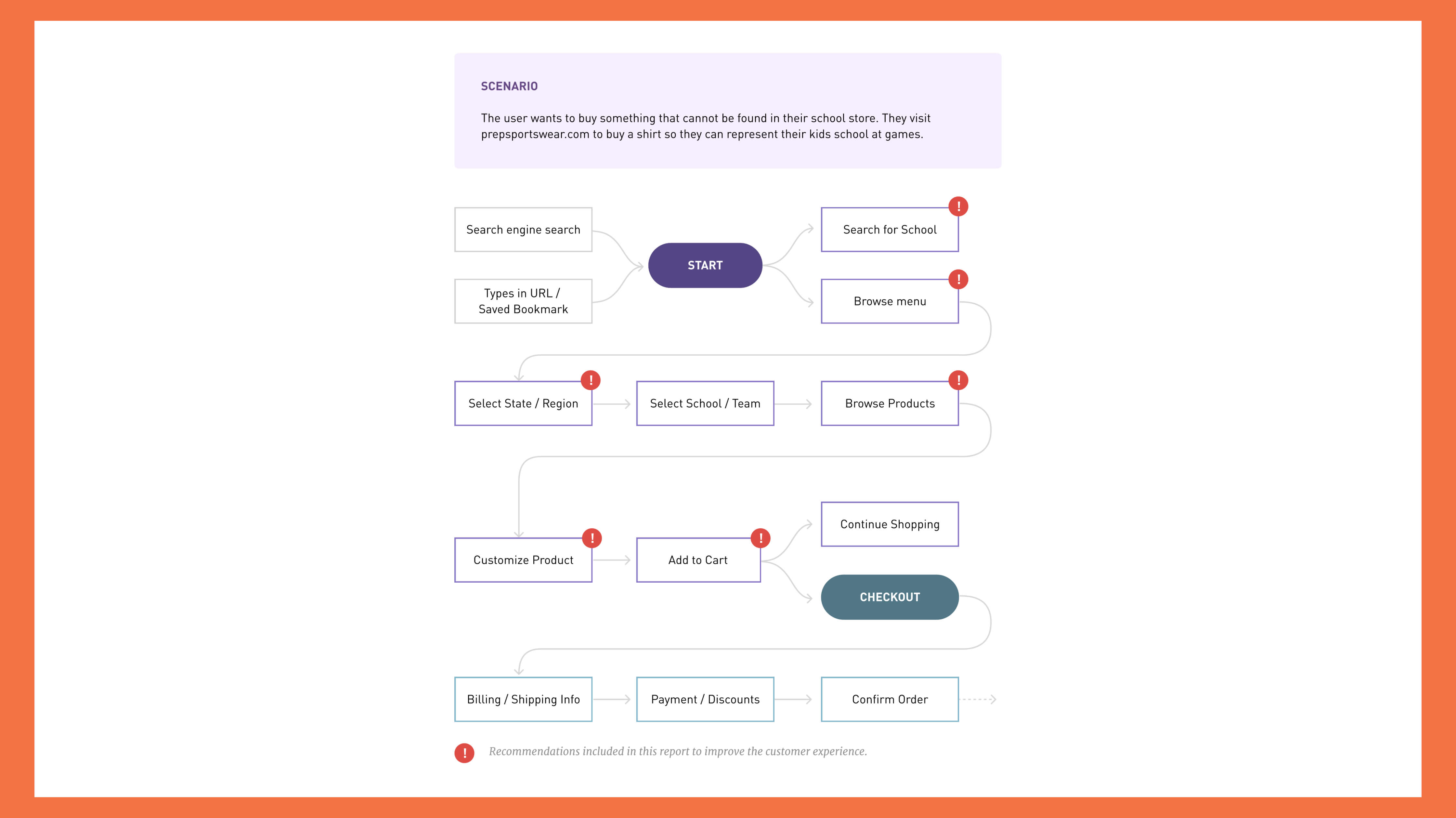
Breaking down the customer journey: Task Analysis
The task analysis examined key user flows, such as finding team-specific products, customizing items, and completing a purchase.

Identifying barriers to a seamless shopping experience
This process revealed friction points in navigation, filtering, and checkout, highlighting opportunities to streamline the customer journey and improve overall usability.
Confusion regarding product options and availability
“Once I get to my store I have a hard time finding the products I want.”
Difficulty finding desired custom team products
“It takes too long to find what I'm looking for. I keep clicking around without finding my team's products”
Unclear instructions for customizing on PDP
“I want to customize my product, but I'm not sure how the process works. It feels complicated and frustrating.”
The solution
The redesigned navigation and search functionality transformed the user experience on Prep Sportswear’s platform. Advanced filters, clear categorization, and team-specific visual cues made product discovery faster and more intuitive, leading to improved customer engagement and higher conversion rates. This solution demonstrates the power of user-centered design in achieving both business and user goals.
Optimizing navigation and search
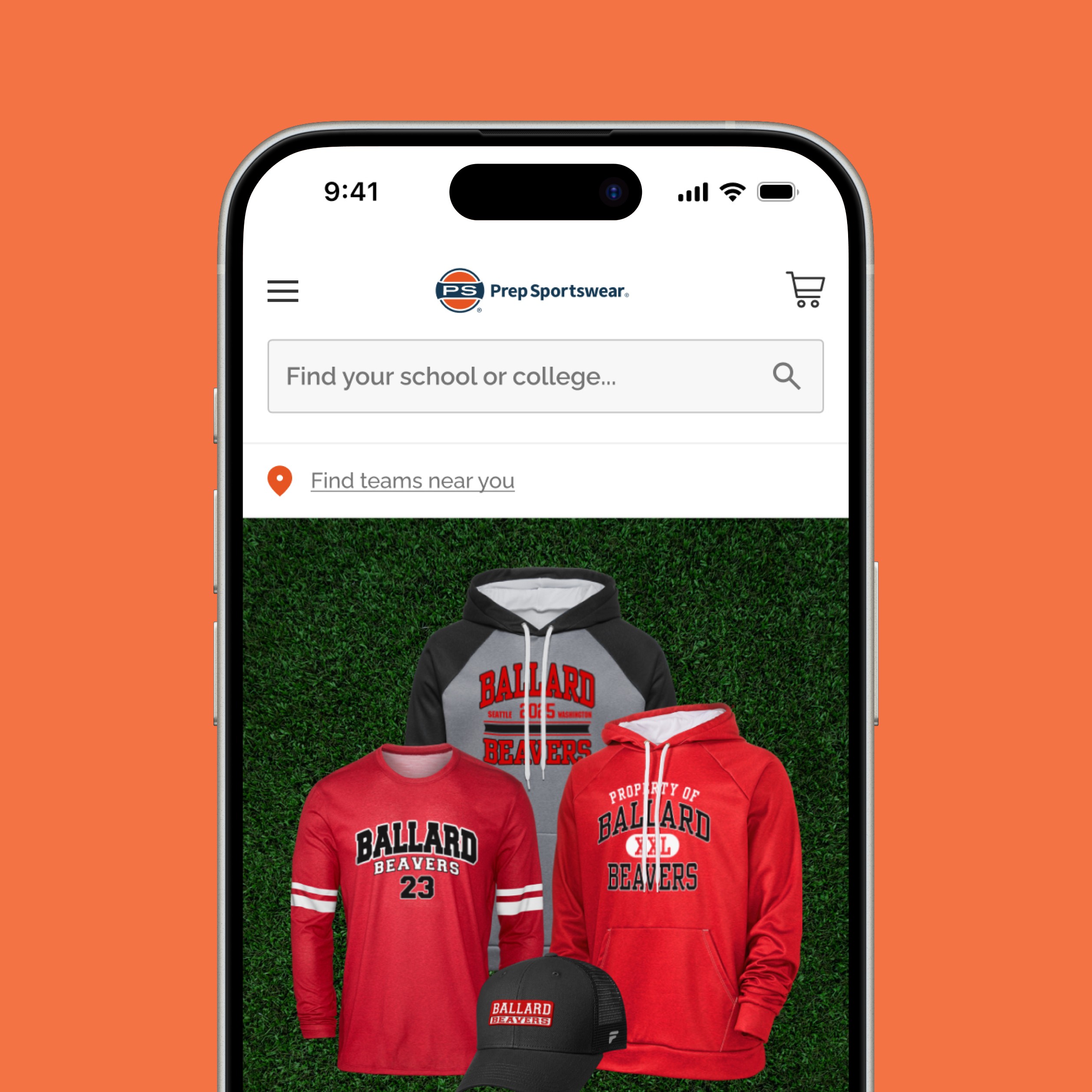
The updated navigation and search make it easy for customers to find team-specific products quickly. With advanced filters and clear categories, the design reduces frustration and enhances the shopping experience.


Customer GEO targeting
The “Find Teams Near You” feature enhances the experience by helping customers quickly discover local teams and relevant products, saving time and adding personalization.
Simplifying customization on the product detail page
The updated Product Detail Page streamlines customization with clear instructions, intuitive design tools, and real-time previews, reducing confusion and making the process effortless for customers.

Looking into the future
Currently I am in the process of redesigning the category pages, team pages and product category pages to reduce customer confusion about available products. Since this is an ongoing project I will continue to update this as I continue to make progress.


