Vintage Brand Ecommerce Redesign
Creating a modern shopping experience for a retro ecommerce brand
Overview
Vintage Brand provides sports enthusiasts with the opportunity to relive the game through iconic and unique retro designs. With the world’s largest collection of historical sports artwork, Vintage Brand transforms these timeless designs into modern products, offering a wide range of merchandise to meet the diverse needs of their customers.
Challenge
How might we create an immersive, mobile-first digital storefront for Vintage Brand that bridges the gap between modern usability and retro aesthetics to establish a strong online presence?
Solution
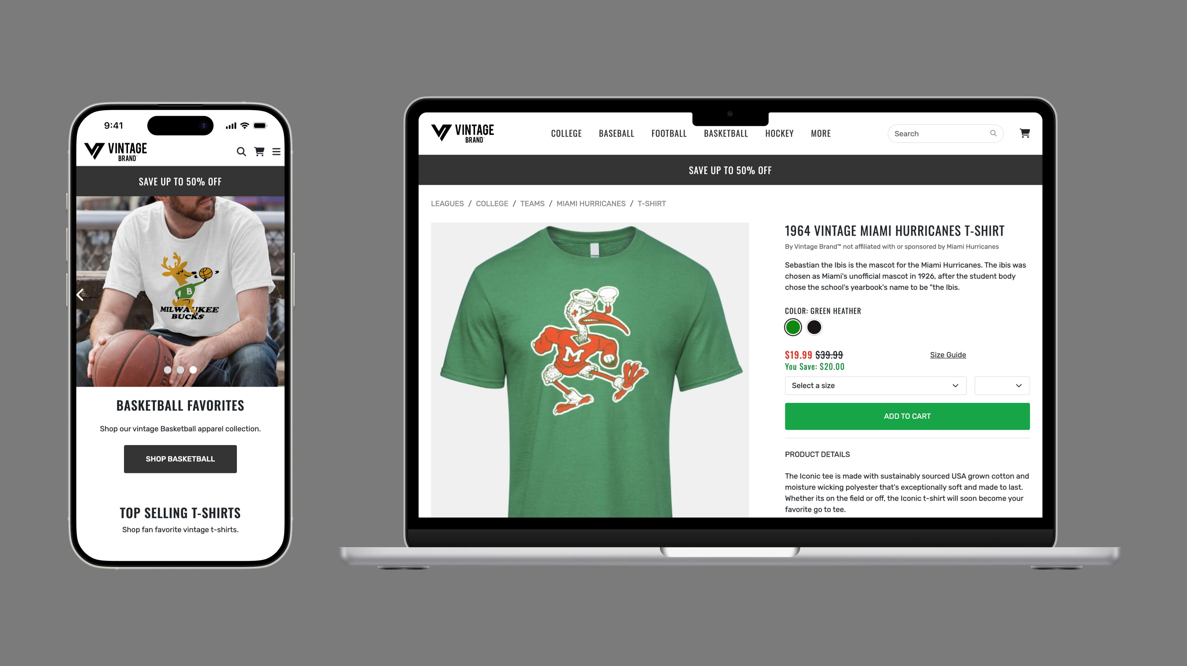
I designed a mobile-first, immersive digital storefront for Vintage Brand that seamlessly blends modern usability with retro aesthetics. The redesign focused on creating an engaging user experience that highlights their extensive collection of historical sports designs while ensuring fast performance and intuitive navigation.
Framing the problem space
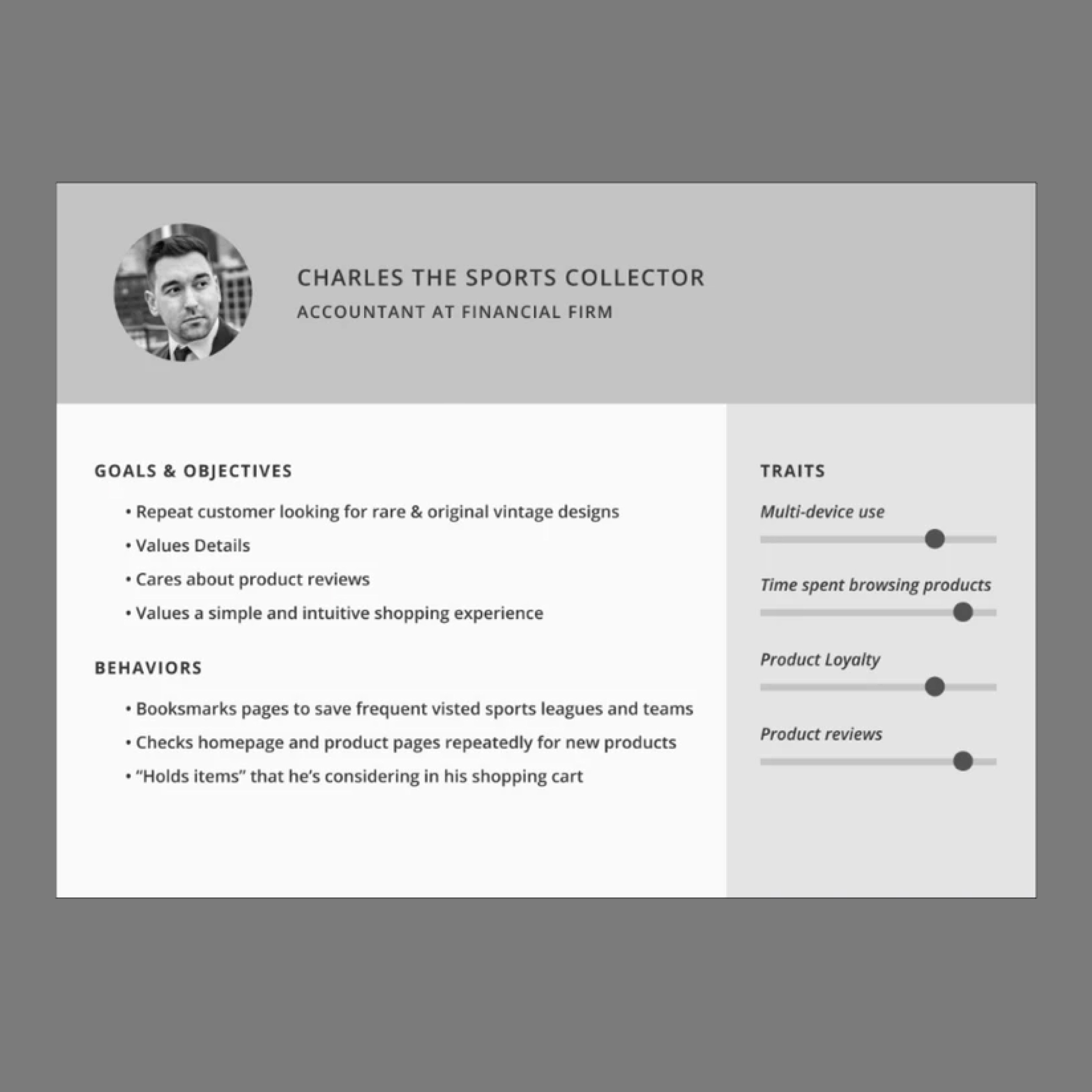
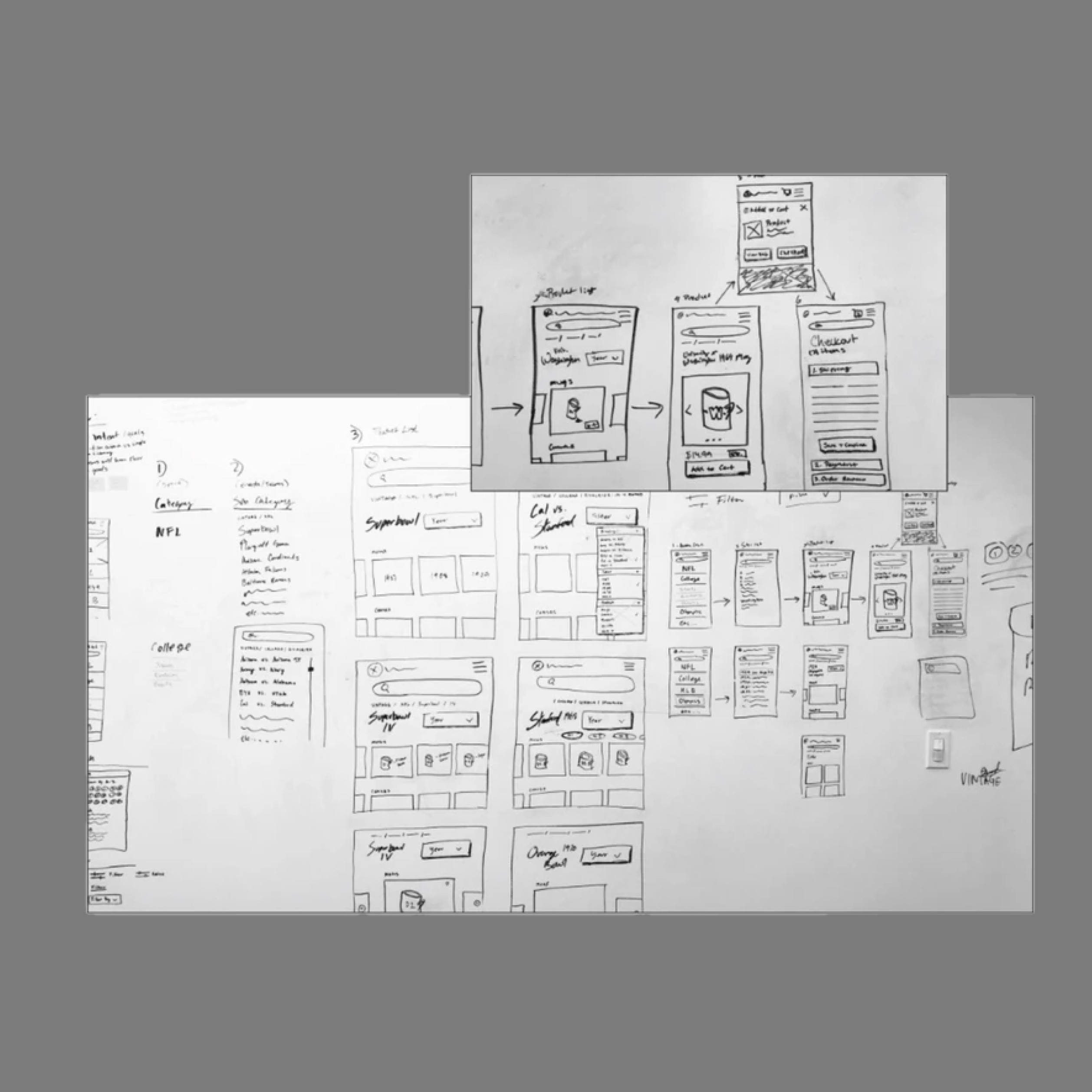
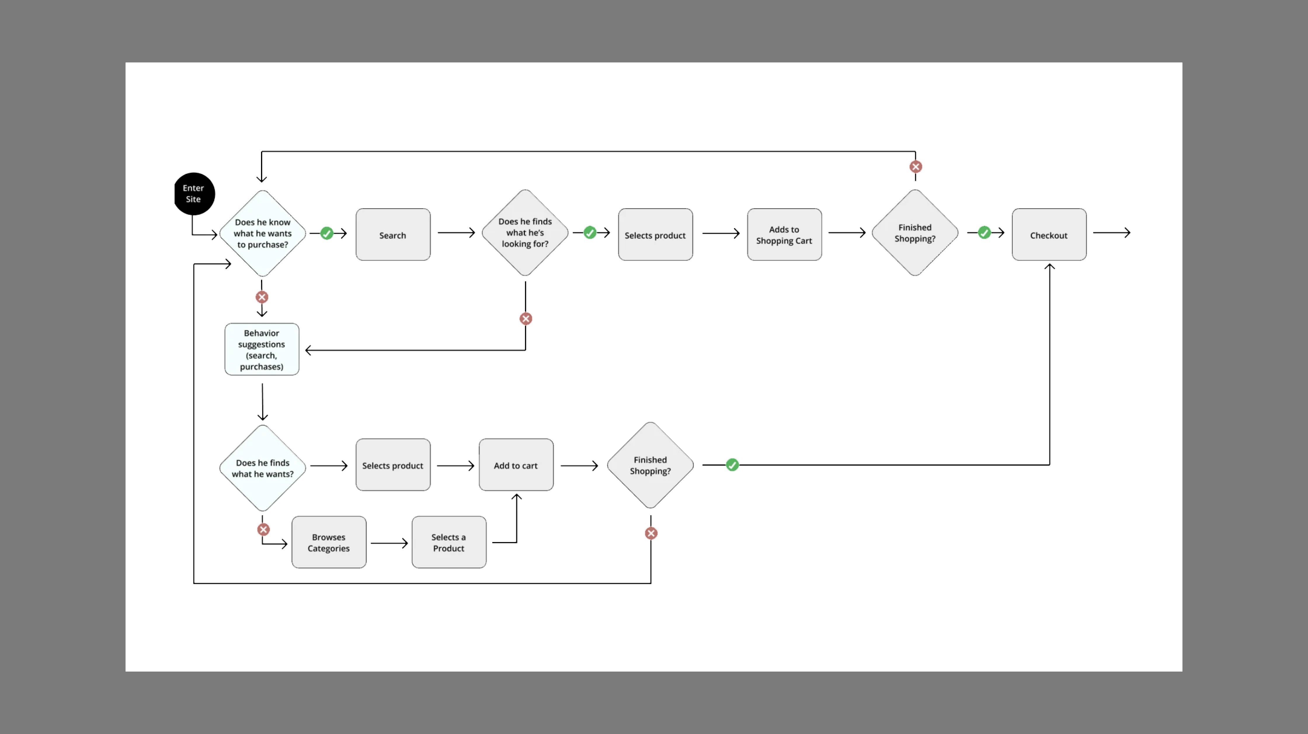
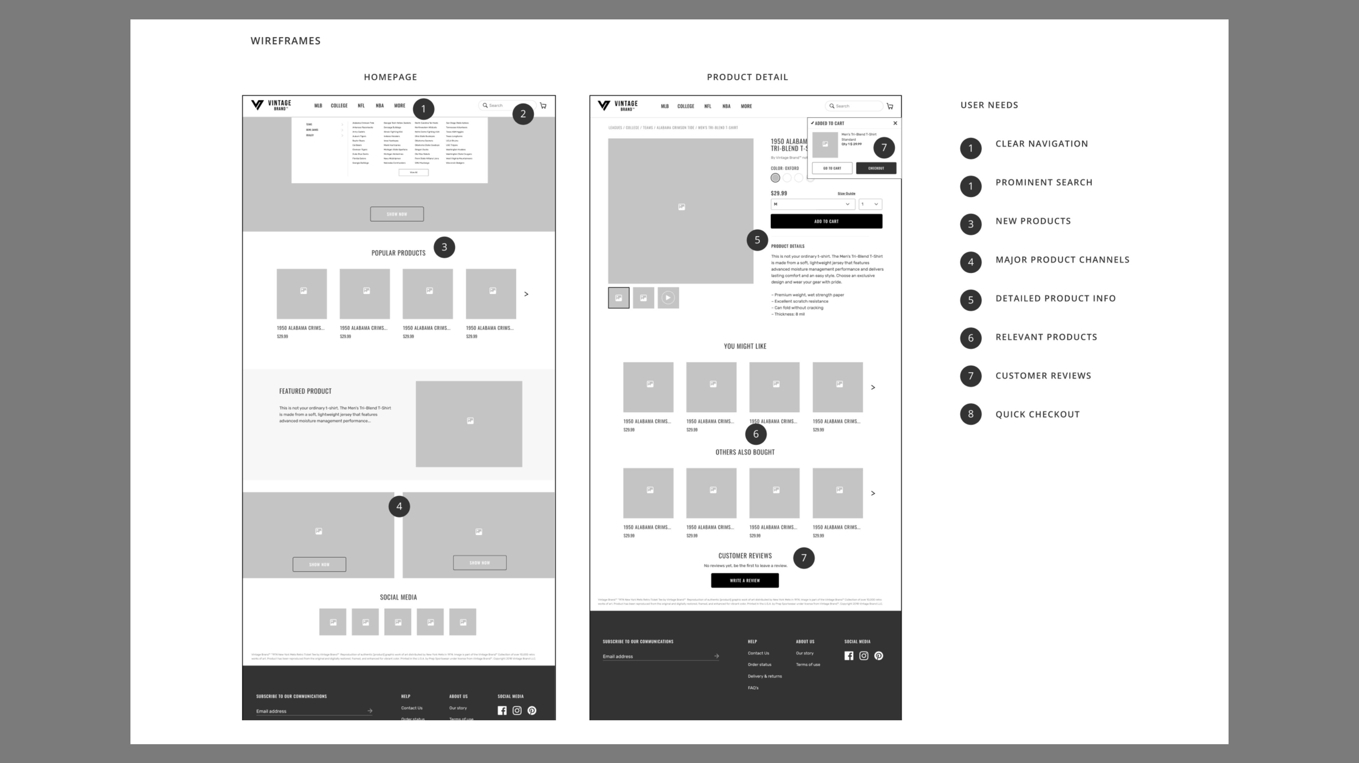
Vintage Brand needed a mobile-first platform to showcase their retro sports designs while blending modern usability with nostalgic aesthetics. To address this, I developed user personas, created initial sketches, mapped user flows, and built wireframes. Prototyping and user testing ensured the design was intuitive and met both business goals and customer needs.
User testing
I conducted usability testing using usertesting.com to validate my prototype solution. I ran two studies, one with simple gray wireframes and the second with visual design. This would ensure that I had critical feedback on functionality that was separate from visual design feedback.
User testing feedback
“Given all the information about the product, I felt very comfortable about proceeding to purchase.”
“I like the design of this website, it's ice and clean.”
“Easy and intuitive flow and navigation. It's a very simple and comfortable shopping process”
The solution
I designed a mobile-first, immersive digital storefront for Vintage Brand that seamlessly blends modern usability with retro aesthetics. The redesign focused on creating an engaging user experience that highlights their extensive collection of historical sports designs while ensuring fast performance and intuitive navigation.
Homepage
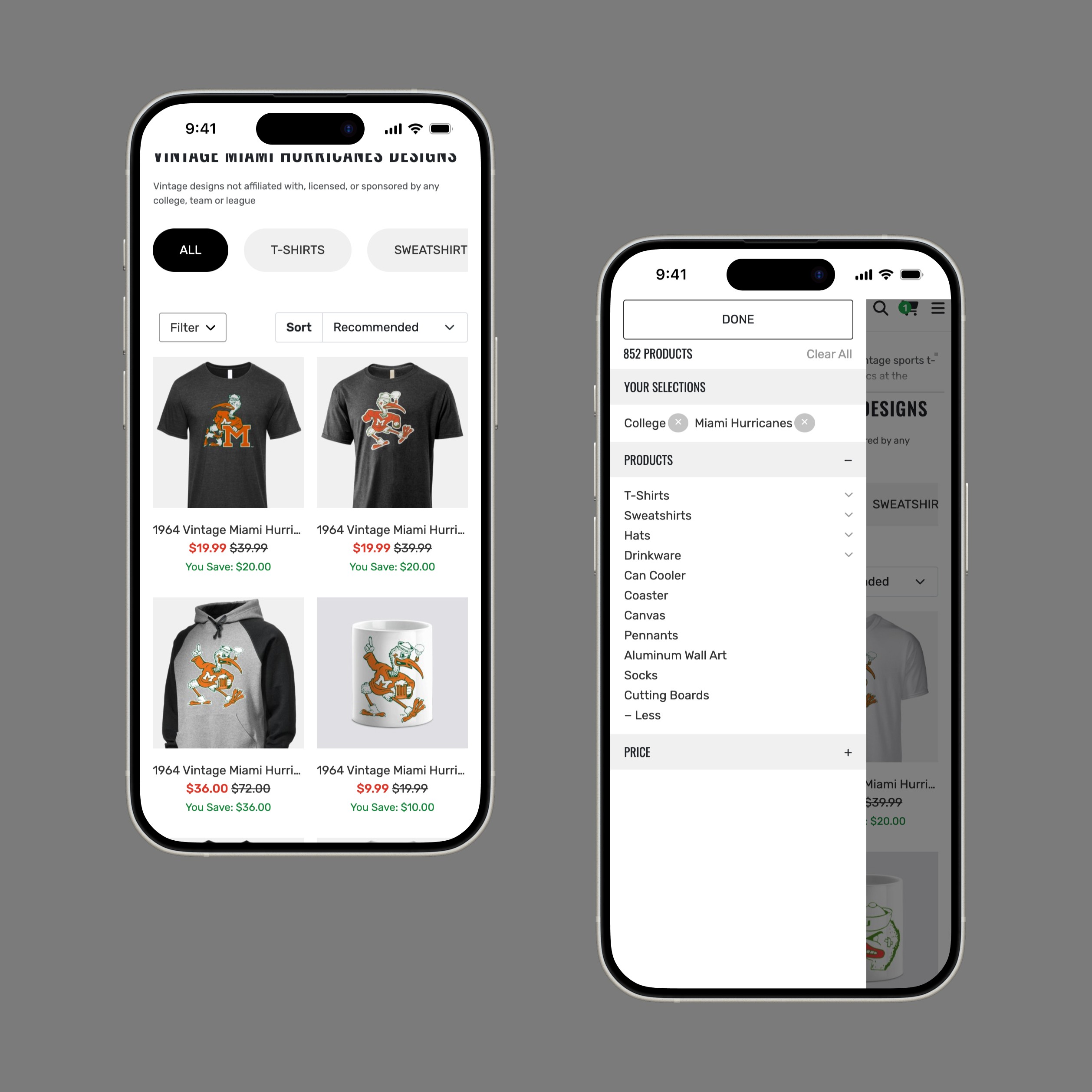
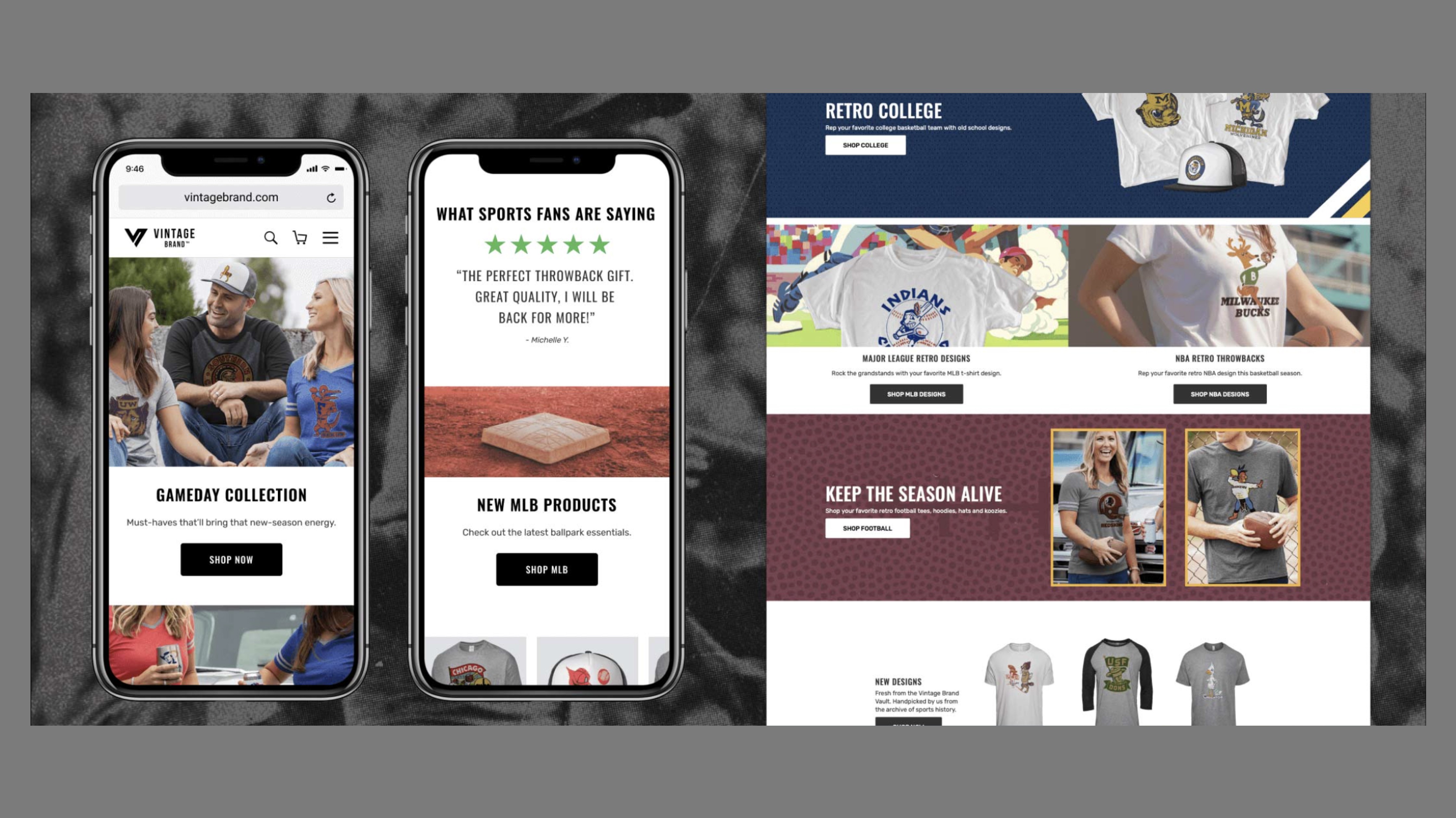
Since the homepage acts as the user’s introduction to the company and its products—it was important for me to create a design that clearly communicates the brand and its product offerings. But just as important—the ability to convey trust, and visual legitimacy to invite users to explore products and make a purchase.

Category page
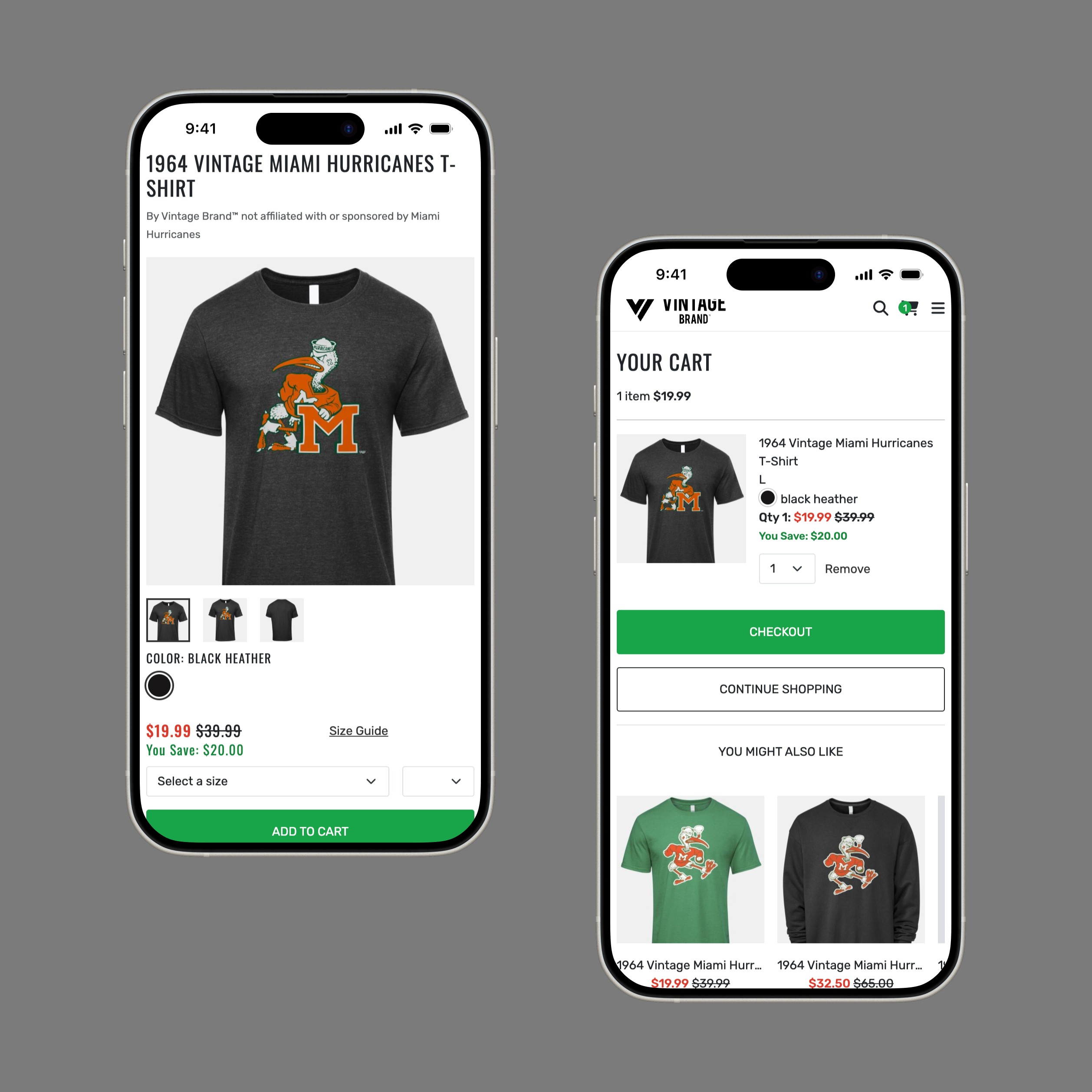
I optimized product detail pages to provide clear information without overwhelming users. Usability studies revealed that zoomable product images were key purchase drivers, so I implemented large image previews. Later, adding product videos boosted conversions, showing the impact of engaging visuals on user decisions.
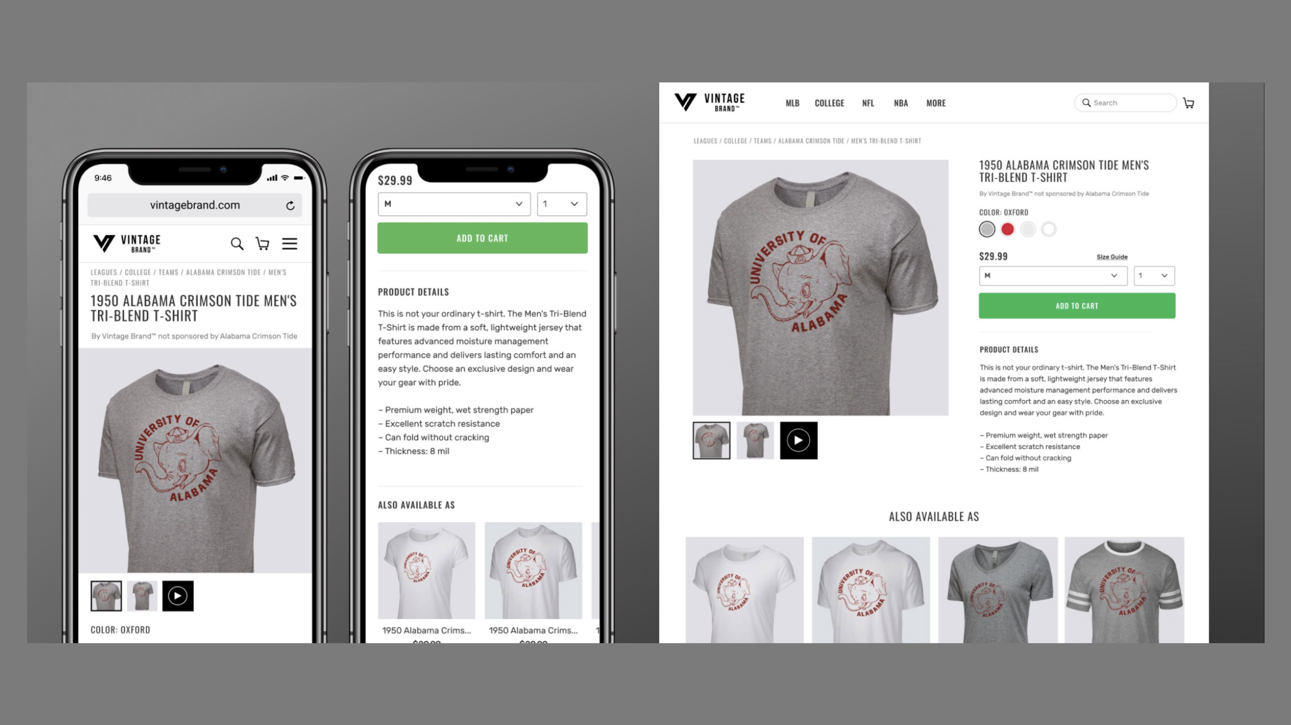
Product detail page
I optimized product detail pages to provide clear information without overwhelming users. Usability studies revealed that zoomable product images were key purchase drivers, so I implemented large image previews. Later, adding product videos boosted conversions, showing the impact of engaging visuals on user decisions.
